All Nova Silva visuals can be found in the Microsoft Appsource and allows you to evaluate and test all functionality from within your own Power BI Desktop reports. If you want to share the reports containing our visuals with other people within your organisation you need a valid license.
Our visuals support three types of licenses: PER USER, PREMIUM, and ENTERPRISE.
The PER USER license can be purchased directly from the Microsoft AppSource. From the AppSource you can license a visual per month or per year. You can even decide to make use of auto renewal (optional). Select the appropriate visual below and click the PER USER Icon to go to the AppSource where you’ll find the pricing plans.
The PREMIUM license can be purchased at this webshop. This license type supports unlimited number of users within a Power BI Premium Capacity. It also supports Power BI Embedded and Power BI Report Server (on Premises). Select the appropriate visual below and click the PREMIUM Icon to go to the product page.
Interested in making use of multiple visuals and working with large number of users? Please contact us to get a quote for the ENTERPRISE edition. This will give you unlimited access to all our visuals for everyone within your organisation.
Powerful insight into your planning and milestone performance
The Gantt chart is an excellent tool to visualize your program and project schedules and task dependencies. In the basis, it is a bar chart with tasks or activities on the vertical axis. The horizontal bars show for each task/activity the period between the start and end date (or time). Another important feature of the Gantt chart is that icons can be used to represent milestones: important moments within your project timeline.
The PowerGantt Chart for Power BI allows you to review both tasks/activities and milestones right in your Power BI reports. The PowerGantt Chart supports unlimited number of task/activities, hierarchy levels and milestones.


Click an icon for more details
Visualise your HTML formatted content to add valuable context to your figures.

Most business applications allow users to enrich the data by adding additional context. Often, this additional context (like comments and feedback) is stored as HTML formatted text. This allows the user to not only include the content, but also apply all kinds of formatting to the content (like Bold, Italic, lists, tables, etc.).
Being able to show this additional context adds value to reports and dashboard, as it helps the readers to better understand the presented figures.
The Shielded HTML Viewer will seamlessly display any HTML-5 formatted text next to other figures in your Power BI reports.
The Shielded HTML Viewer will only process and render HTML-tags and -attributes that are specified in our allow-list. This to mitigate potential security risks (such as inline scripting). Any tag or attribute not specified on the allow-list will be ignored.

Click an icon for more details
Effective and clean supervision of your project progress

In every medium to large project there is a set of milestones. Milestones are critical moments during a project that are used to mark project progress. But we also know milestone dates can change: some are brought forward and some get delayed.
These changes in milestone dates are early warning signals of challenges in your project progress. The Milestone Trend Analysis Chart for Power BI gives every project manager a clear overview of these changes. It visualizes what is and is not working in the project. It also helps to signal issues with the project scope.

Click an icon for more details
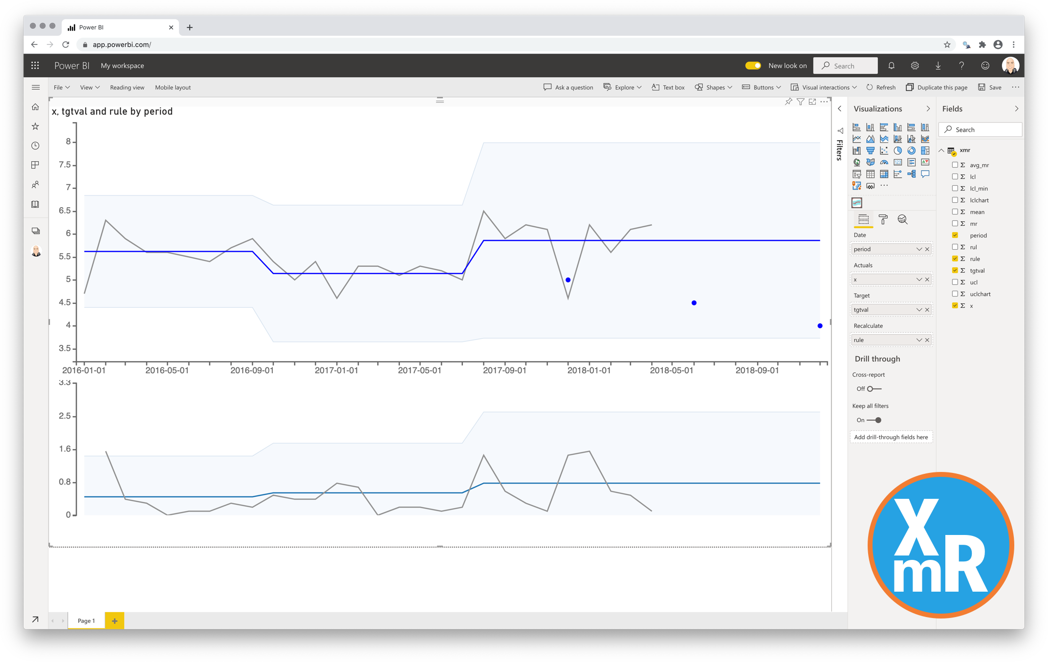
The most useful way to see true signals of change in your KPI is to use a ControlChart (XmR chart)

The ControlChart chart is actually two charts. The X is the data point being measured and mR the Moving Range which is the difference between consecutive data point measurements.
The upper chart (X-Chart) displays the data-points over time (Actuals) together with a calculated average (Average – center-line (CL)). The calculated average is then used to calculate the Upper and Lower Control Limits. The lower chart displays the Moving Range (mR-Chart) with its Average and Upper Control Limit. There is no lower control limit as the value of the difference between consecutive actual-values is recorded as an Absolute Value (positive number).
In this custom visual you can hide the lower chart (mR-Chart).
The calculation of the charts can set to Automatic in this visual. The rules being used for the automatic recalculation are:
- 7 points in a row are above or below the center-line
- 10 out of 12 points are above or below the center-line
- 3 out of 4 points are closer to the UCL or LCL than the center-line
You also can add a data-value that enables manual calculation. The charts will be recalculated at the date-value where the value is set to 1.

Click an icon for more details
Discover your seasonal patterns with the Cycle Plot

Time series data are great to clarify the changes over time in measures, and the line chart is the favourite chart for this type of data. But displaying results with a normal line chart can also obscure important patterns, especially if the measure contains some form of seasonality. The cycle plot (first introduced by Cleveland, Dunn, and Terpenning in 1978) is a type of line chart specifically developed to show seasonal time series.
The cycle plot helps you to visualise trends within your seasonal data. It has the strengths of common line charts, without obscuring important cyclical patterns. The cycle plot offers a great deal of flexibility in the choice of your variables: think of months vs. year, hours vs. day or months vs. presidential period.
Let’s illustrate this with an example. Say we are looking at temperatures in a certain city over a few years. We expect that Winters are colder than Summers. Plotting this with a line chart will yield a line with a cyclical pattern: low values in Winter, high values in Summer. However, it’s hard to tell if temperatures in January are increasing or decreasing over the years. With the cycle plot, a subplot can be created for each month, showing the change in temperatures over time for that month. All the subplots together still show the seasonal pattern as well, as seen in the image above.

Click an icon for more details
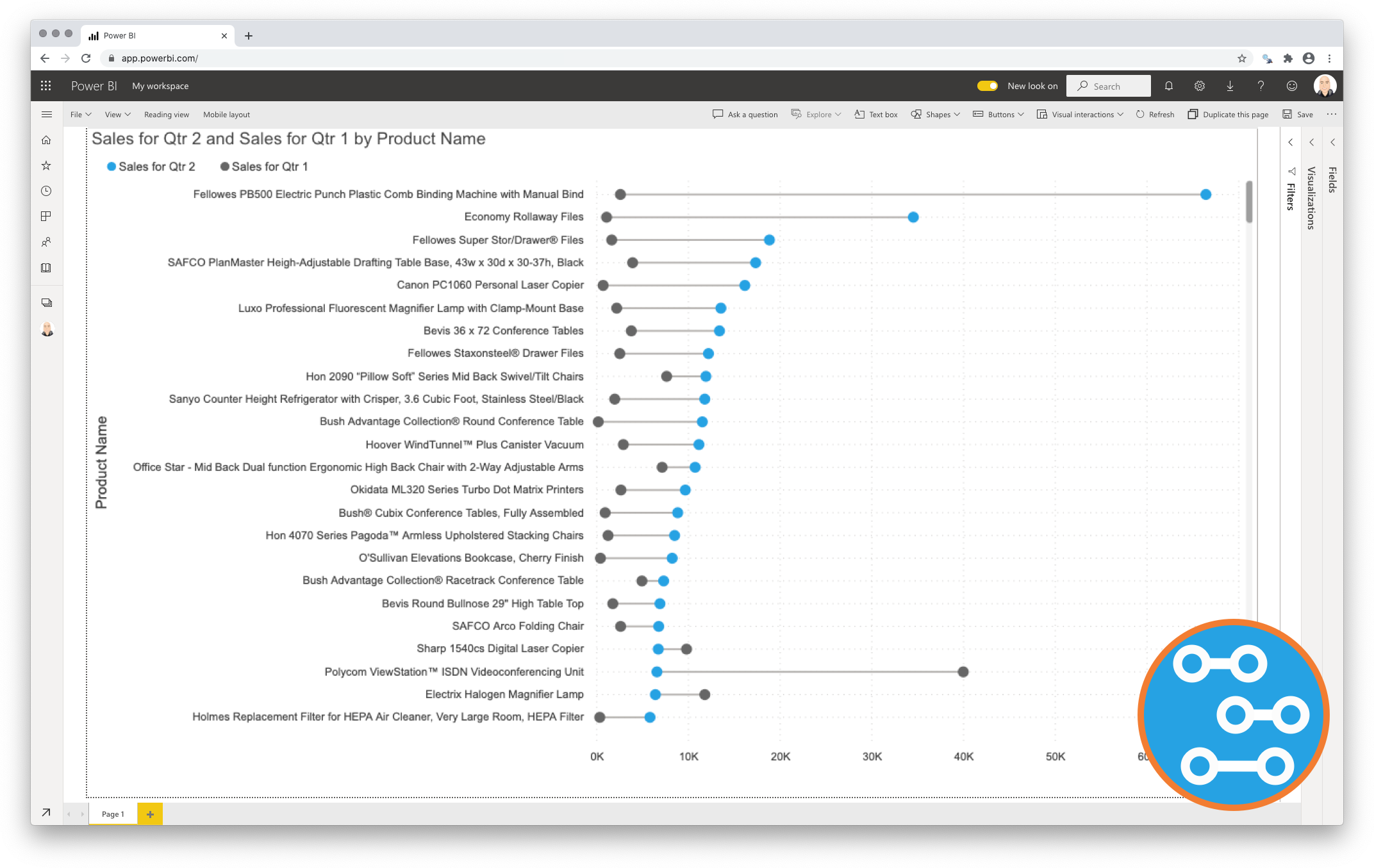
Unleash the power of comparison with the Dumbbell Chart

Data visualisations play a fundamental role in answering an important data question:”How does result A compare to result B?”. Typical examples of these questions are:
- How does the sales of this month compare to the sales of last month?
- What is the difference between the number of documents processed this year compared to 2017?
- How does the number of planned-visitors compare to the number of unplanned-visitors at our locations?
Key in answering these kind of questions is explicitly visualising the difference between the two results. This is the strength of the Dumbbell Bar Chart: showing both the values and the difference between them.

Click an icon for more details
-
 Dumbbell Bar Chart for Power BI€0.90
 -
 Dumbbell Column Chart for Power BI€0.90
 -
 Dumbbell Bar Chart for Power BI PremiumFrom: €103.75 / month
 -
 Dumbbell Column Chart for Power BI PremiumFrom: €103.75 / month
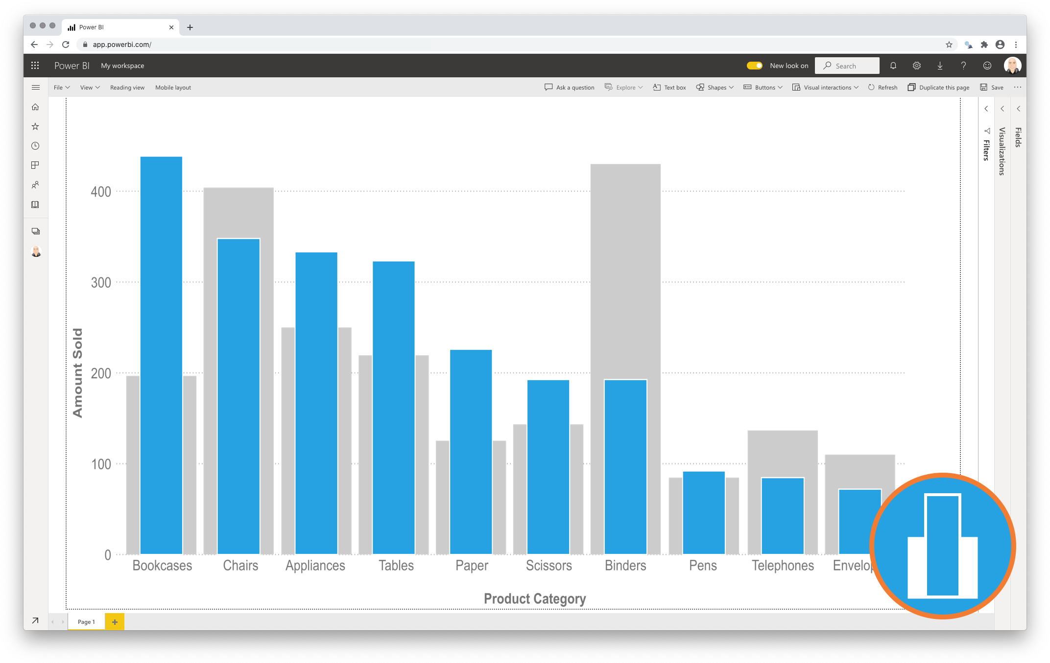
Compact and precise visual comparison of two measures with a Lipstick Chart

Regularly the standard Bar/Column Chart is used to compare two measures within a number of categories. If one of these measures has been added as a reference (secondary measure) to increase the context of the primary measure it would be better to clearly show this priority difference.
This is precisely what the Lipstick Chart does: It shows the primary measure per category on the foreground, and places the secondary measure behind it for a precise comparison of both values. Since both values are placed on top of each other it also becomes a more compact alternative to show both measures per category.

Click an icon for more details
-
 Lipstick Bar Chart for Power BI€0.90
 -
 Lipstick Column Chart for Power BI€0.90
 -
 Lipstick Bar Chart for Power BI PremiumFrom: €103.75 / month
 -
 Lipstick Column Chart for Power BI PremiumFrom: €103.75 / month
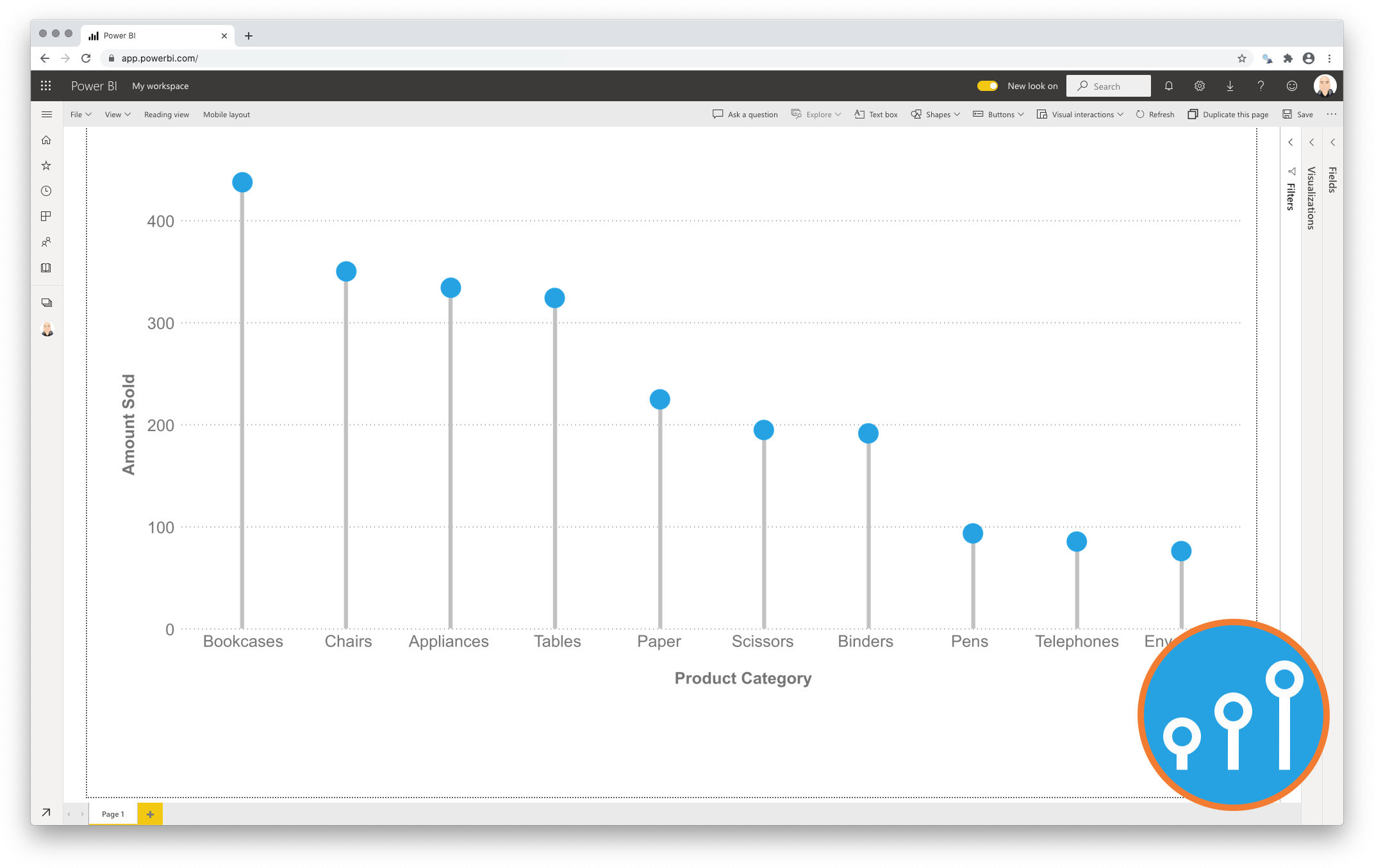
Declutter your comparisons with a Lollipop Chart

Standard bar/column charts are ideal for showing a single measure per category so you can easily compare each of the categories with the rest. However, if you have larger number of categories (>10) in a bar/column chart it is possible the chart itself becomes “heavy” because large part of the surface of the chart will be filled with the bar color(s).
To avoid this clutter one can use the Lollipop Chart as an alternative to the standard bar chart. It shows an icon (mostly a dot) per category at the corresponding measure value for each category. The icon is connected to the measure-axis origin by a subtle line. The icon combined with the line make it a Lollipop Chart.

Click an icon for more details
-
 Lollipop Bar Chart for Power BI€0.90
 -
 Lollipop Column Chart for Power BI€0.90
 -
 Lollipop Bar Chart for Power BI PremiumFrom: €103.75 / month
 -
 Lollipop Column Chart for Power BI PremiumFrom: €103.75 / month
Discover the patterns across multiple measures with the Merged Bar Chart

The Merged Bar Chart allows you to compare multiple categories in a single chart, as an alternative to the more complex scatterplot.
Comparing categories is a common goal of data visualisations. In some cases comparing categories on a single measure (e.g. weight per shipment) is enough. This can be done with a standard bar or column chart. However, this is often not enough. Let’s assume we need another measure (like height) to make the comparison more insightful. Now we have one category (shipment) and two independent measures (weight and height). Because these measures are expressed in different units (pounds vs. inches) we can’t combine them in a single bar/column chart. This is when the scatterplot becomes useful.
However, many people find scatterplots hard to read. And it is difficult to expand the number of measures beyond 3 or 4. This is why we created the Merged Bar Chart. This chart can show up to 6 independent measures per category in a comprehensible way. It does this by displaying each measure in it’s own bar-column and allows you to sort on any of the columns to investigate any possible relations between the measures.

Click an icon for more details
Display your key indicators in one view with the SMART KPI List

One of the principal goals of any dashboard is to inform its users by creating an overview of multiple key performance indicators (KPIs). A good dashboard shows all relevant KPIs in a single screen, so we need a compact and effective way to display them. The SMART KPI List is created specifically for this purpose.
Usually the S.M.A.R.T framework is used as a guide in the setting of objectives. Here we have used it to describe this visual:
- Specific
To allow for our dashboard to be specific we need to display all important indicators in one single overview and make sure we surround the indicator with sufficient context. Measures that need our immediate attention can be highlighted, done with a red dot next to the sparkline; - Measurable
A value on its own is a weak indicator of your performance. By providing context this can be greatly improved. A sparkline shows you the trend to determine if you are moving towards your goal. By including a target value you can determine your distance from that goal. This is done by adding both a number and a target line in the bar chart to visually indicate progress. You can even show the difference between the current value and the target as a percentage by a deviation chart (as shown in the example below); - Achievable
By adding target values you allow the reader to not only determine if a metric has met expectations, but also show the difference with the actual results; - Relevant
Within the sparkline you can add a bandwidth of acceptabel results (the grey area in the example) which helps the user to identify “normal” and “abnormal” results in the past; - Time-bound
The sparkline adds the required historic context to each indicator to enrich the indicators signals. The Last date column provides you insights in the latest refresh date of the indicator;

Click an icon for more details
Get to know your data without hiding critical details: the Strip Plot

There are numerous chart types to help us determine the main properties of a distribution (like central tendency, spread and form). The most popular ones are histograms, frequency polygons and box-and-whisker plots.
The challenge with these kind of charts is the fact they group your data in such a way it potentially could hide important features. Histograms and frequency polygons are extremely sensitive to the bin-size you select as user. The box-and-whisker plot is only applicable when you have a bell-shaped distribution, but becomes useless in case of a multimodal distribution.
The Strip Plot is a chart type that addresses these challenges by not aggregating any of the data points, but by simply showing each point individually. This will not only show you where the (concentration of) observations are, but also where gaps are between subsequent observations.

Click an icon for more details


